Color marketing. Do you know what effect colors have?

I would like to start this article with a very nice slogan, the Color Marketing Group uses: „Color sells, and the „right“ color sells better“.
Have you ever thought, what colors are you choosing for your marketing message, your company's website or just for your business card? What was the reason you chose certain colors? You did it because you liked it or because your marketing message needed those colors? Even though visual appearance is very important, you must always know that different colors provoke different reactions to your message. So, do you really know what kind of information your message is providing?
It is often hard to believe that colors may have influence to our mind and body. However scientists know that for a long time, that colors have impact to our physiology and mental state. In a study, Wohlfarth and Sam observed 14 handicapped children in a different color environments. The experiment showed that different colors had a measurable change in blood pressure and a decrease in aggressive behavior . After that it was clear that colors stimulate our nervous system and cause different emotional states.
Market researches show that more than 80% of visual information is connected to colors. In other words, colors send the required information. For example, have you ever noticed that most fast food restaurants use red and orange colors? They know that those colors stimulate people to eat quickly and leave – and that's exactly what restaurants want. Also it is no surprise that most adult websites use red and black colors. It is thought that these colors have sexual attraction.
So, before planning any marketing message it would be wise to gather some informataion about psycholgy of colors. It does not matter if it's a business card, a brochure, a website or a poster. All colors have some kind of influence to our behavior and you must know what kind of behavior your message will provoke.
Much bigger influence colors have in virtual environment. Knowing the fact that there is almost no posibility to communicate with clients personally, a visual effect becomes the most important part. In this case the words are what matters most, but colors are very important as well. The background of your website, the color of the text and title, all can have some psychological influence to your clients. Knowing how colors affect people you can make your website more attractive and your brand more memorable. You must know that correct colors send correct message and attract client's attention where you need most.
Lots of researches were made to find out what kind of effect colors have. Here are some interesting facts:
- A research was made at COLOR EXPO 2004 in Seoul which showed that 92,6% of respondents most attention give to appearance, 5,6% - to touch and 0,9% - to hearing and smell. Later another survey was made and it showed that 84,7% of respondents told that colors have the biggest influence to their choice.
- CCICOLOR research showed that people make a subconscious judgment about a person, environment, or product within 90 seconds of initial viewing. And between 62% and 90% of that assessment is based on color alone.
- Study at University of Loyola, Maryland showed that color increase the recognition of a brand up to 80%
- Psychologists noticed that colors stimulate our brains to remember things better. It is much easier to remember a colored picture than the same picture in black and white colors.
- Colors increase: readability – 40%; ability to remember – 55% to 78%, understanding – 73%.
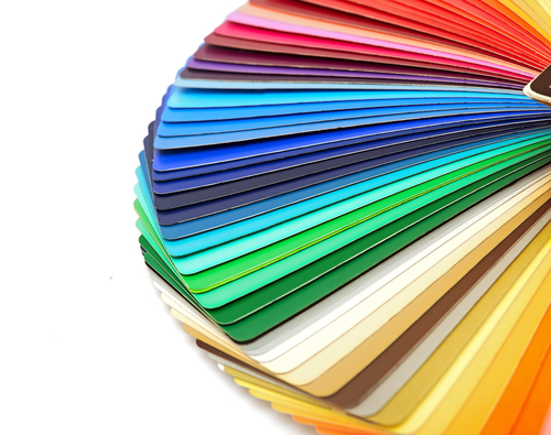
So, what meaning does each color have? Below is the list and meanings of the most common colors. All colors are divided into 3 groups: neutral, warm, cold.
Neutral colors
Black. This color associates with authority and power, stability and force. Also it is connected with inteligence, elegance, sophistication and seducement. Black clothes makes people thinner. Sometimes this color is associated with mysticism. Black is very seriuos color, which provokes strong emotions; too much of this color might shock people.
You should not use this color too much, only in some small places, because it can be linked to depression. Black can very easily be associated with aristocracy. Also you can attract young people using this color for mystical image. It is advisable to use another strong color together to provoke some positive feelings.
White. For most, this color associates with purity, virginity (wedding dress), youth, cleanliness (doctor's suit), safety. Also it symbolyzes neutrality or just a state of no colors. Some of the eastern countries associates this color with morning death.
It is advisable to use this color for background as it brightens other colors. White color reflect sunlight and multiplies making the environment to look wider than it really is. This color does not have any negative effect, unless it is used almost everywhere.
Gray. This color associates with practicality, eternity, solid things in life, conservatyvism, safety, maturity. Too much of this color makes no different to emotions, however sensible amount of this color can make things look more solid. Shades and shadows associates with old age, death, depression, gloominess.
It is advisable to use this color sparingly. It gives confidence about your website and brightens other colors.
Brown. This color associates with reliability, stability, and friendship. It is a color of Earth and associates with naturality and organic things. However in India this color means mourning.
It is advisable to use this color in order to make you look reliable and honest.
Warm colors
Red. If you want to attract somenone's attention, you should use this color. Red is energetic color. It associates with movement and excitement. People, surrounded by this color have their heart beating a little faster. This color is definetily not suitable for children room, because it excites people. Red clothes gives more attention from other people. This color symbolizes life, that's why chinese brides are wearing red clothes. Also red color is associated with passion, sex, speed and danger.
It is advisable not to use too much of this color on your website, because it might irritate people. However choosing the right spot may give benefits. Red objects stimulates people to act.
Pink. This is a true love color. It is the most soothing color of all. Most criminals are jailed to cells with pink environment because it helps to surpress their aggression. This color associates with romance, ease and sweet emotions.
It is advisable to use this color when you want to take advantage of client's care and romantic side.
Yellow. This is a happy color which associates with laugh, joy and good times. People surrounded by this color feel optimistic, because brains release more serotonin which makes feel better. It accelerates metabolism and triggers creative thoughts.
It is advisable to use this color when you want to make your website look brighter and lighter. Also it brightens other colors.
Orange. This color associates with good times, happy and active days, warm and organic products. Also it is associated with ambitions.
It is very good color to use on websites about food, extreme activities and websites for children.
Cold colors
Blue. This color is one of the most favorite colors in the world. It surrounds the biggest part of our world (sky, seas, oceans...). Blue color makes people calm. It is very often that bedrooms have a lot of this color because it associates with peace ant rest. For many many years this color is asociated with strength, reliability, wisdom and loyality. Scientists noticed that employers are providing much more productivity when working in blue environment. Some researches show that weight lifters can lift bigger weights in blue gym than they ussualy do.
This color gives formality to your website. It will give confidence about your company to your client when using this color very sensible. However too much of this color can make people hesitate.
Green. It associates with growing, nature and money. This color is very calming and provides positive emotions. Hospitals often use pale green because it calms patients. Also it associates with jealousy, luck, generosity and fertility. Traditionally it symbolizes peace, harmony, support and balanced energy.
This color can be used for websites about money , finance or somekind of growth. It is advisable to use this color if you want the client to click certain link or buy certain product.
Purple. This color is associated with wealth, welfare , sophistication and mysticism. It stimulate the part of brains which helps in problem solving. This color is very popular among young teenager girls.
Using the right colors for your website
There are 3 main strategies when creating a website:
- Monochromatic Color Scheme - when single color in varying shades is used. It makes the website look clean and interesting. Such kind of website is soothing and pleasing especially when blue or green colors are use.
- Complimentary Color Scheme - when high contrast of color is used by selecting colors directly opposite from one another on the color wheel (such as pink and lime green). This puts a warm color with a cool color and is pleasing to the eye.
- Triple Color Scheme - it uses three colors equally spaced from each other around a color wheel. It's popular with web designers and allows for a harmonious color scheme.
It is always important to follow some rules in order to select correct colors for your project. Below is some basic rules everyone should follow in order to choose clolors seccesfully:
- Know you market. Is it asians or americans? Is it old or young audience? High or low income? Male or female? You must speak their language in order to make contact.
- Do a market research. Market research and testing is very important. Design several versions of the site, and test those designs on the target market.
- Watch the Car Market. Car manufacturers spend millions on research to figure out which colors are most attractive. Watch the top selling car colors to see emerging trends. Lexus appears to be especially sensitive to colors.
- Use safe colors. Unless you're dealing with a strong brand, stick with safe colors. Purple and orange will never have the positive color responses of blue, beige or green.
")

